
|
 08-03-2009, 03:08 AM
|
#1 |
|
Posts: 4,834
 
|
WWE Belt
I'm watchign the The Bash right now and the current WWE Championship belt has got to go. It`s horrible looking. Only fit for John Cena, and for anybody else its a pile of garbage. Randy Orton looks ridiculous with it.
|

|

|
|
08-03-2009, 03:22 AM
|
#2 |
|
Retired Prolly.

Posts: 11,296
|
He's just keeping it warm for Cena, that's why they don't change it.
|
|
|
|
|
08-03-2009, 03:38 AM
|
#3 |
|
Posts: 4,834
|
Still, it is a mad ugly belt. A far stretch from the Eagle Belt they used to have. Even the ``Attitude`` Era belt and ``Undisputed`` Belt look way more presitigious. It looks like a kids belt. I can`t take it seriously at all. It`s pretty sad when the ``WCW`` style looking belt looks more like a REAL Championship than the WWE Belt.
|
|
|
|
|
08-03-2009, 03:56 AM
|
#4 |
|
Last of a Dying Forum

Posts: 16,215

|
 Even looked less Lampoonish. |
|
|
|
|
08-03-2009, 04:10 AM
|
#5 | |
|
I believe in Joe Hendry

Posts: 22,351
|
Quote:
Last edited by owenbrown; 08-03-2009 at 04:21 AM. |
|
|
|
|
|
08-03-2009, 04:17 AM
|
#6 |
|
Posts: 4,834
|
Yeah, but its only a PG show when it`s convenient to say so...
|
|
|
|
|
08-03-2009, 04:23 AM
|
#7 |
|
So fucking sexy.

Posts: 20,100
|
If it doesn't spin, it's not pandering to Cena. So why not stylize it to be not hideous?
|
|
|
|
|
08-03-2009, 04:30 AM
|
#8 |
|
Last of a Dying Forum
Posts: 16,215
|
okay, ANY of these look better than the current. Insane:
http://www.kayfabememories.com/BeltG...f-wwfbelts.htm |
|
|
|
|
08-03-2009, 04:32 AM
|
#9 |
|
So fucking sexy.
Posts: 20,100
|
Well...I wouldn't agree with that....
|
|
|
|
|
08-03-2009, 05:56 AM
|
#10 |
|
dave ain't here?

Posts: 2,709
|
lol Tag Team belts in '71.
|
|
|
|
|
08-03-2009, 05:56 AM
|
#11 |
|
TPWW's Hardcore Legend

Posts: 2,502
|
 Heavyweight Belt circa 1988-1998 that one is awesome but still, bring back the smoking skull belt 
|
|
|
|
|
08-03-2009, 05:58 AM
|
#12 |
|
dave ain't here?
Posts: 2,709
|
Yeah the current WWE title is absolutely ridiculous. Can't wait for someone to destroy it, could see someone like Jericho doing it (if he's ever in the title picture again).
|
|
|
|
|
08-03-2009, 06:05 AM
|
#13 |
|
b/c 5 is better than 4

Posts: 9,721
|
at least the fucking thing doesn't spin any more.....
|
|
|
|
|
08-03-2009, 06:05 AM
|
#14 |
|
TPWW's Hardcore Legend
Posts: 2,502
|
does anyone else think that the 'cena' belt kind of looks like a morpher from the original power rangers?
|
|
|
|
|
08-03-2009, 06:35 AM
|
#15 |
|
King K Cool

Posts: 28,472
|
I remember reading somewhere that the reason the WWE Championship looks the way is does is because it's suppose to reflect "Pop Culture" so to speak.
Like it has all it's "Bling" and it's square-ish design to it, so it looks all modern-ish and whatnot and "Champ" on the front of the belt instead of "Championship" and the left side plate previously had "Mon Nite" instead of "Monday Night" on it due to shortening of words and text speak that have grown more popular and more widely accepted in society and all that crap. But I personally hate the design of the current WWE Championship. I've said it since the design was unveiled but it just looks like 50 Cent threw up on a strap of leather. But I doubt the design is going to change anytime soon. I think we might have to put up with the current design for about another 5 years or so. Purely guessing. |
|
|
|
|
08-03-2009, 06:52 AM
|
#16 |
|
I'm Mr. White Christmas

Posts: 44,526
|
 best title belt...ever |
|
|
|
|
08-03-2009, 06:55 AM
|
#17 |
|
TPWW's Hardcore Legend
Posts: 2,502
|
do you remember the wwf hardcore title, i always used to worry when the wrestlers would get hit in the face with that, the corners are pretty sharp
|
|
|
|
|
08-03-2009, 07:21 AM
|
#18 |
|
dave ain't here?
Posts: 2,709
|
Why would you worry? Thought you'd have liked it?
|
|
|
|
|
08-03-2009, 07:39 AM
|
#19 | |
|
TPWW's Hardcore Legend
Posts: 2,502
|
Quote:
|
|
|
|
|
|
08-03-2009, 07:41 AM
|
#20 |
|
dave ain't here?
Posts: 2,709
|
Too extreme?
|
|
|
|
|
08-03-2009, 07:42 AM
|
#21 |
|
Posts: 2,256
|
Little random fact: The current WWE Championship belt has been around longer than the Attitude era style WWE Championship.
|
|
|
|
|
08-03-2009, 07:58 AM
|
#22 | |
|
TPWW's Hardcore Legend
Posts: 2,502
|
Quote:
|
|
|
|
|
|
08-03-2009, 09:43 AM
|
#23 | |
|
EATER OF HOT POCKETS

Posts: 14,340
|
Quote:
|
|
|
|
|
|
08-03-2009, 10:50 AM
|
#24 |
|
Southern Hospitality

Posts: 9,437
|
bring back the "Rated R" belt
|
|
|
|
|
08-03-2009, 12:17 PM
|
#25 |
|
He's Here

Posts: 60,735
|
The belt sucks. It's fine for Cena, but almost anyone else it just doesn't work. It only looks good on one person other than Cena.
Hi MC. 
|
|
|
|
|
08-03-2009, 12:29 PM
|
#26 |
|
LUV CABBAGE/H8 JEWS

Posts: 42,497
|
Aww, fuck the belt. Let'em roll with smiley-face stickers and diplommas.
|
|
|
|
|
08-03-2009, 12:32 PM
|
#27 |
|
RIP SABU

Posts: 35,585
|
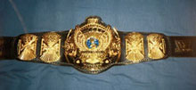
Anybody remember THIS eyesore?:
 And I think that was back in the days when the centerpiece still spun, too. UGH!  to that design. to that design.
|
|
|
|
|
08-03-2009, 12:34 PM
|
#28 | |
|
He's Here
Posts: 60,735
|
Quote:
===0==  ==0=== ==0===
|
|
|
|
|
|
08-03-2009, 01:13 PM
|
#29 | |
|
Retired Prolly.
Posts: 11,296
|
Quote:
Spaz. |
|
|
|
|
|
08-03-2009, 04:14 PM
|
#30 | |
|
He's Here
Posts: 60,735
|
Quote:
Last edited by Xero; 08-03-2009 at 04:17 PM. |
|
|
|
|
|
08-03-2009, 04:53 PM
|
#31 | |
|
RIP SABU
Posts: 35,585
|
Quote:
But I kind of disagree with the fact of having a different, customized belt for each new champion that comes along, especially with how quickly the main belts have been changing recently...A.) You'd have to think of a design that conveys the person's persona to a "T", and B.) Doing such for every new superstar, I can only imagine, would cost a shitload of money, that I'm not sure Vince's cheap self would be willing to shell out every 3 weeks or 2 months or whatever. |
|
|
|
|
|
08-03-2009, 05:17 PM
|
#32 |
|
He's Here
Posts: 60,735
|
No, I meant I'm assuming they made a completely new belt instead of switching out the center plate.
Every wrestler at the top level has a logo. There you go. And yeah, it would cost a shitload, but they'd also be able to sell every design they make. At the very least all faces should get a custom center piece. |
|
|
|
|
08-03-2009, 06:01 PM
|
#33 |
|
Cranky Kong

Posts: 78,671
|
I think a unique belt for each champion would be sweet as shit. It's entirely ridiculous that everybody's wearing Cena's flare.
|
|
|
|
|
08-03-2009, 06:58 PM
|
#34 |
|
TPWW's HHH Mark Since '04

Posts: 29,886
|
The Rated R belt fit Edge's character though.
|
|
|
|
|
08-03-2009, 07:17 PM
|
#35 |
|
Cranky Kong
Posts: 78,671
|
Yeah DAMN iNATOR, what the fuck is wrong with you, you fucking prick???
|
|
|
|
|
08-04-2009, 10:20 AM
|
#36 |
|
Posts: 61,634
|
This thread is making me pretty sad. Facts like the current design being around for like four years, and Cena not having held it for two are depressing. Well, I'd rather not see Cena with the title, but it makes me feel a little old.
I'd love to see a new design for the WWE Championship. I think WrestleMania XXV would have been a great place to debut it. Why not Summerslam now? |
|
|
|
|
08-04-2009, 01:06 PM
|
#37 | |
|
Southern Hospitality
Posts: 9,437
|
Quote:
After Orton drops Cena at Summerslam he comes out on Raw the next night and debuts and new belt |
|
|
|
|
|
08-04-2009, 01:51 PM
|
#38 |

Posts: 3,743
|
Think they're afraid that if it were a heel escpecially were to somehow banish it they would make them even more over with the non kiddie Cena fans. Personally i'd like to see the previous belt simply replace it again and pretend the Spinner belt never existed quite frankly. Jeff Hardy was probably the only other person than Cena that looked right with it for some reason and even then it was a stretch.
|
|
|
|
|
08-04-2009, 01:53 PM
|
#39 |
|
Southern Hospitality
Posts: 9,437
|
Just like the US Title spinner belt. gone and forgotten
|
|
|
|
|
08-04-2009, 09:20 PM
|
#40 | |
|
RIP SABU
Posts: 35,585
|
Quote:
 I mean look at it...it seriously puts the classic WWE U.S. Championship desing to shame with all the (can't tell if it's real or fake, but whatever) bling, and the centerpiece design with the U.S. Flags on either side...I don't know about anyone else, but to me that right there just SCREAMS "pizzazz". 
|
|
|
|
|




 Linear Mode

