 |
|
|
#1 |
|
I Am Perfection
Posts: 1,178
  
|
Actual Classic IC Title Or Not?
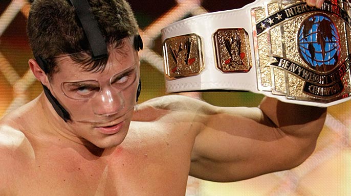
As I was browsing through replica titles I found myself wondering...is the IC title Rhodes is currently carrying the actual Classic Intercontinental Championship. Or is it a remake? The actual classic IC title would have the classic WWF Logo at the top.
 So being the genius that I am. I decided to think outside of the box and I googled images of the classic IC title. I was unable to find a clear photo of the logo area. In every image that came up, it was either carefully covered up, or too blurry to tell. So is the title legit or a remake? First one to answer correctly gets Pos. Rep and a hand job from Juan. |
|
|

|
|
|
#2 |
|
Over Like Rover
Posts: 38,444
            
|
of course it's a remake
|
|
|

|
|
|
#3 |
|
He's Here
Posts: 60,735
            
|
It has the WWE logo on it.
/thread |
|
|

|
|
|
#4 |
|
Is Finkle
Posts: 88,974
            
|
 Yeah. |
|
|

|
|
|
#5 |
|
I Am Perfection
Posts: 1,178
  
|
still not exactly clear in that photo Lock Jaw
|
|
|

|
|
|
#6 |
|
He's Here
Posts: 60,735
            
|
It's clearly the scratch WWE logo. You don't need a 2000x1200 picture to realize that.
But fuck it, here: 
|
|
|

|
|
|
#7 |
|
Over Like Rover
Posts: 38,444
            
|
it's clearly different to the late 80's/90's version in places
|
|
|

|
|
|
#8 |
|
Posts: 3,743
       
|
|
|
|

|
|
|
#9 |
|
He's Here
Posts: 60,735
            
|
 Good enough? |
|
|

|
|
|
#10 |
|
He's Here
Posts: 60,735
            
|
It's clearly a different belt with some different textures, but it's the same basic design.
I don't understand, though, why there's a huge blob over the WWE logo. Edit: Oh, wait, I think they're supposed to be little wrestlers doing moves. |
|
|

|
|
|
#11 |
|
Over Like Rover
Posts: 38,444
            
|
|
|
|

|
|
|
#12 |
|
Posts: 3,743
       
|
It's not a blob it's supposed to be the same image from the original of two wrestlers only the replication of the engraving has been done horrendously.
|
|
|

|
|
|
#13 |
|
I Am Perfection
Posts: 1,178
  
|
I"m talking about the logo at the top of the middle plate.
|
|
|

|
|
|
#14 |
|
Over Like Rover
Posts: 38,444
            
|
yes, it's the scratch logo. As has been pointed out repeatedly
|
|
|

|
|
|
#15 |
|
I Am Perfection
Posts: 1,178
  
|
|
|
|

|
|
|
#16 |
|
He's Here
Posts: 60,735
            
|
Mystery solved for the fifth time:

|
|
|

|
|
|
#17 |
|
I Am Perfection
Posts: 1,178
  
|
....Good enough then
Rep. Awarded |
|
|

|
|
|
#18 |
|
Posts: 6,350
       
|
It's a remodeled version of the classic IC Title, basically. It had a "facelift" of sorts.
|
|
|

|
|
|
#19 |
|
He's Here
Posts: 60,735
            
|
Undashing Intercontinental Championship.
|
|
|

|
|
|
#20 |
|
Posts: 6,350
       
|
I wonder how this version of the IC Title would look with black instead of white.
Awesome, I'm sure. |
|
|

|
|
|
#21 |
|
I Am Perfection
Posts: 1,178
  
|
What about the yellow warrior version
|
|
|

|
|
|
#22 |
|
As over as Crystal Pepsi
Posts: 21,639
           
|
 The first title, I believe. The one Cody Rhodes has is not even a remake. [/title nazi] |
|
|

|
|
|
#23 |
|
Cranky Kong
Posts: 78,671
            
|
Who cares? It's still badass and better than the last one.
|
|
|

|
|
|
#24 |
|
Posts: 6,350
       
|
They made the classic IC Title even better.
If they somehow did the same with the old eagle WWF Title... |
|
|

|
|
|
#25 |
|
Quark is Less Impressed.
Posts: 38,371
            
|
I liked better when the WWF logo was red in the IC design and they actually called it the Intercontinental Heavyweight Championship.
|
|
|

|
|
|
#26 |
|
Lizard King
Posts: 158
 
|
I just quite like that it says "Intercontinental Heavyweight wrestling champion" and not "Intercontinental sports entertainment superstar"
|
|
|

|