
|
|
|||||||
| View Poll Results: Worst WrestleMania logo? | |||
| WrsetleMania 2 |
|
0 | 0% |
| WrestleMania 11 |
|
4 | 22.22% |
| WrestleMania 13 |
|
6 | 33.33% |
| WrestleMania 15 |
|
1 | 5.56% |
| WrestleMania 2000 |
|
1 | 5.56% |
| WrestleMania 27 |
|
1 | 5.56% |
| WrestleMania 28 |
|
4 | 22.22% |
| WrestleMania 33 |
|
1 | 5.56% |
| Other *List Below* |
|
1 | 5.56% |
| Multiple Choice Poll. Voters: 18. You must log in or register to vote on this poll. | |||
 |
|
|
Thread Tools | Display Modes |
 03-08-2016, 12:42 PM
|
#1 |
|
Trickster Demon
Posts: 59,823
  
|
Worst WrestleMania logo of all-time
Which one is the worst...
|

|

|
|
03-08-2016, 12:49 PM
|
#2 |
|
They're eating the dogs..
Posts: 27,469
|

|
|
|
|
|
03-08-2016, 12:54 PM
|
#3 |
|
( ._.)
Posts: 14,422
|
The best one was WrestleManiaX8
Fun Fact: Shisen and I were at WMX8 |
|
|
|
|
03-08-2016, 12:54 PM
|
#4 |
|
( ._.)
Posts: 14,422
|
Worst might be #13 or the last one you posted.
|
|
|
|
|
03-08-2016, 12:56 PM
|
#5 |
|
They're eating the dogs..
Posts: 27,469
|
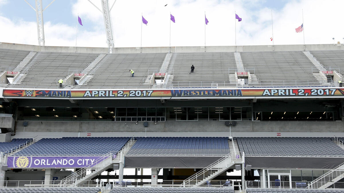
Citrus bowl is in a shitty part of Orlando. Very "urban". Racists prob should not attend this event.
|
|
|
|
|
03-08-2016, 01:31 PM
|
#6 |
|
Legit Jive Soul Bro
Posts: 372
|
Yea,and ford field is in the whitest of neighborhoods
|
|
|
|
|
03-08-2016, 01:44 PM
|
#7 |
|
Triple A
Posts: 133,040
|
That WrestleMania 2 logo is cool imo
|
|
|
|
|
03-08-2016, 01:47 PM
|
#8 | |
|
EATER OF HOT POCKETS
Posts: 14,340
|
Quote:
|
|
|
|
|
|
03-08-2016, 01:47 PM
|
#9 |
|
Forever
Posts: 23,569
|
Hated 11
|
|
|
|
|
03-08-2016, 02:04 PM
|
#10 | |
|
( ._.)
Posts: 14,422
|
Quote:
|
|
|
|
|
|
03-08-2016, 02:05 PM
|
#11 | |
|
They're eating the dogs..
Posts: 27,469
|
Quote:
|
|
|
|
|
|
03-08-2016, 02:09 PM
|
#12 |
|
They're eating the dogs..
Posts: 27,469
|
Last year's was pretty generic. No roman numerals, no numbers but a play button. Lame.
|
|
|
|
|
03-08-2016, 04:09 PM
|
#13 | |
|
Trickster Demon
Posts: 59,823
|
Quote:
|
|
|
|
|
|
03-09-2016, 12:36 AM
|
#14 |
|
Trickster Demon
Posts: 59,823
|
WrestleMania 13 really bad graphics...WM14 had really good graphics the next year
WrestleMania 27/28 both really generic, no personality |
|
|
|
|
03-09-2016, 08:46 AM
|
#15 |
|
Trickster Demon
Posts: 59,823
|
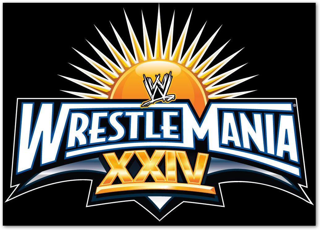
33 isn't bad - but when you compare to 24, the last WM held at the Citrus Bowl, it looks so plain.
 |
|
|
|
|
03-09-2016, 08:58 AM
|
#16 |
|
( ._.)
Posts: 14,422
|
I think 15 had a good logo
|
|
|
|
|
03-09-2016, 10:53 AM
|
#17 |
|
Posts: 61,634
|
Yeah, I don't mind 15. 13 is really bad though. 27 and 28 are boring as fuck. Play button sucked.
|
|
|
|
|
03-09-2016, 10:54 AM
|
#18 |
|
Posts: 61,634
|
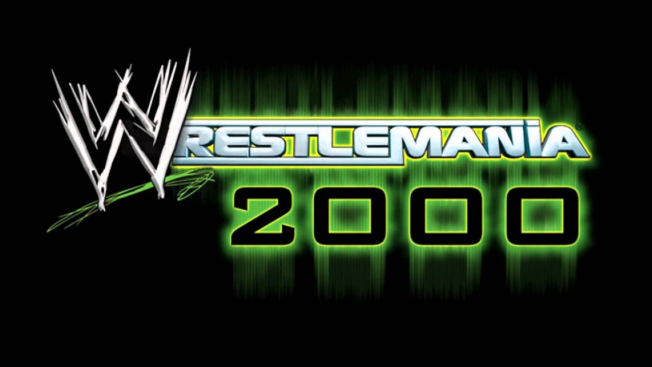
Going to throw it out there: Beyond nostalgia, that WrestleMania 2000 looks like it was done in one minute by a high school and we all know it.
|
|
|
|
|
03-09-2016, 11:54 AM
|
#19 |
|
Trickster Demon
Posts: 59,823
|
I think I only find 15 'just ok' because it seems to light for the attitude era...like should maybe be dark silver instead of pearl and dark gold instead of light gold, donut know.
|
|
|
|
|
03-09-2016, 01:06 PM
|
#20 |
|
Black Sheep Jew
Posts: 8,859
|
Have they confirmed 33 for WM or are they still bidding? Also...I hope that isn't the final logo for it if it is in Orlando....boooring.
Still say the worst is 11 even though I have fond memories from that period as a kid..its just ugly. |
|
|
|
|
03-09-2016, 01:42 PM
|
#21 |
|
Trickster Demon
Posts: 59,823
|
Yeah, they had a press conference and announced it on WWE.com, John Cena rocked a salmon blazer at the press conference
|
|
|
|
|
03-09-2016, 01:48 PM
|
#22 |
|
Trickster Demon
Posts: 59,823
|
|
|
|
|
|
03-09-2016, 06:47 PM
|
#23 | |
|
RIP SABU
Posts: 35,585
|
Quote:
|
|
|
|
|
|
03-09-2016, 06:52 PM
|
#24 |
|
RIP SABU
Posts: 35,585
|
If we're going to include WM 2000 and WM 15 on the list, we might as well use the original images...:
 This actually wasn't even a question in my mind. As soon as I saw the thread title, I thought "DEFINITELY WM20000". |
|
|
|
|
03-09-2016, 06:55 PM
|
#25 |
|
Is Finkle
Posts: 88,992
|
WFRESTLEMANIA 2000
|
|
|
|
|
03-09-2016, 06:56 PM
|
#26 |
|
Is Finkle
Posts: 88,992
|
They should have added that angry sun from Super Mario 3 to the Wrestlemania 33 logo
|
|
|
|
|
03-09-2016, 11:15 PM
|
#27 |
|
TPWW's HHH Mark Since '04
Posts: 29,886
|

|
|
|
|


 Linear Mode

